To see issues of Rosecrance’s Reach Magazine, which I also designed, click here.
Rosecrance, a Rockford-based not-for-profit specializing in substance abuse, addiction recovery and mental health treatment, posed some interesting design challenges. The company was very image conscious and had strict color, typography and a visual rules to follow, meaning most of my designs for program flyers, ads and other materials were built along the same, company-mandated template. Here are a few pieces where I was able to color outside the lines…
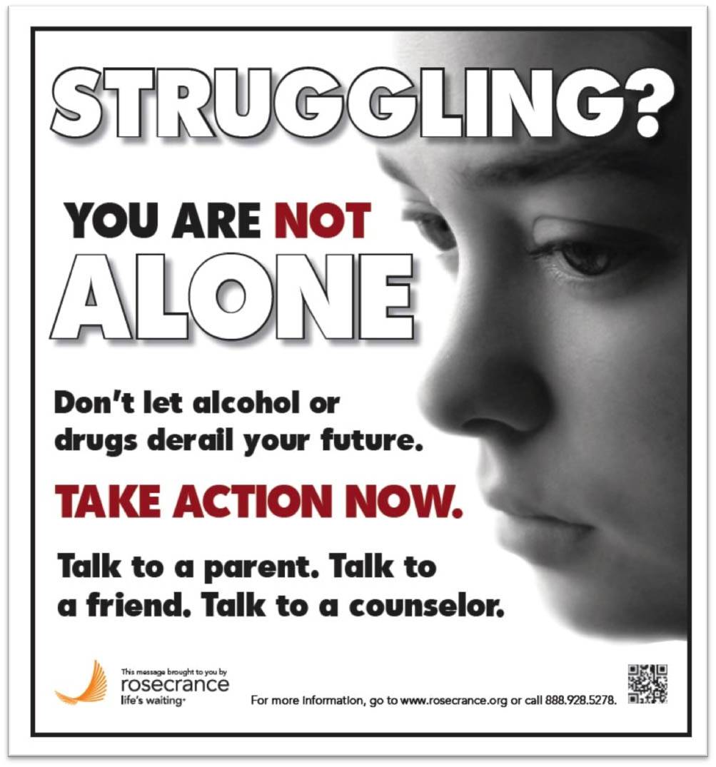
Student Poster
Rosecrance specialized in treatment of adolescent addiction, and this poster was designed to hang in local high schools. Because it was aimed at teens themselves (and not, unlike most Rosecrance pieces, at their parents), it was allowed to be bolder, more graphic and use a different color palette.
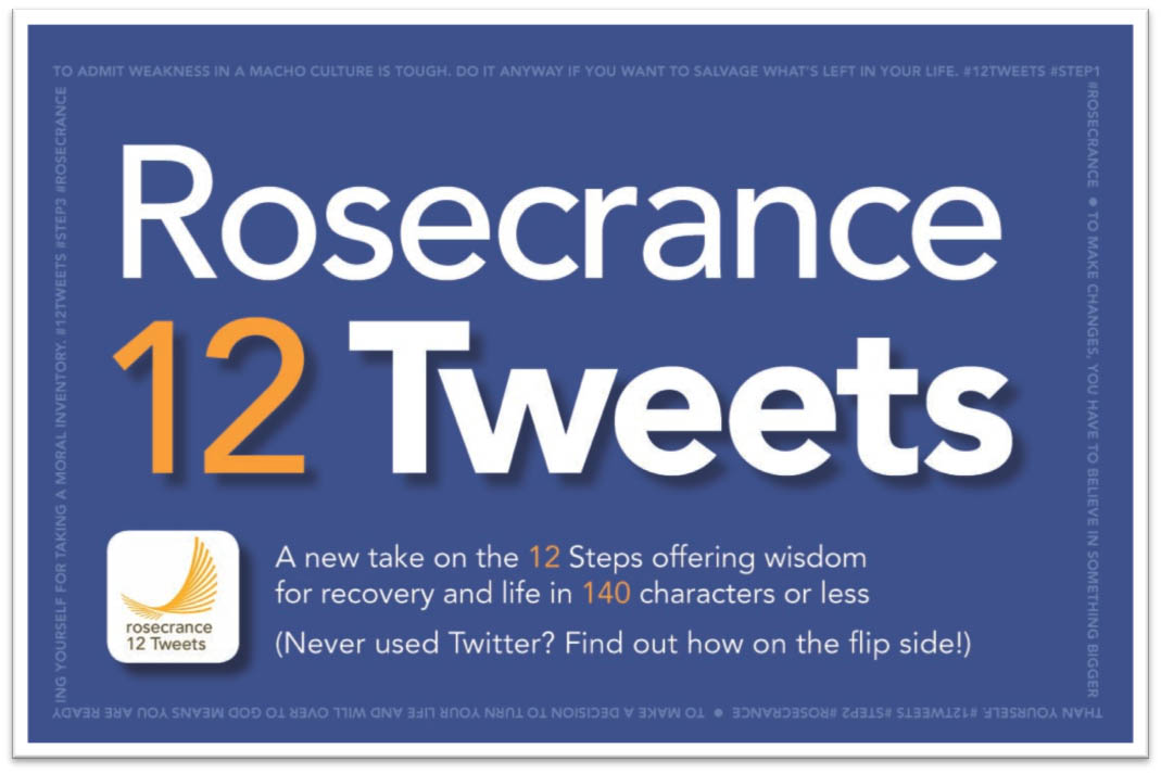
 Rosecrance 12 Tweets Information Card
Like many substance abuse facilities, Rosecrance subscribes to the philosophy of the 12 Step Program. To bring this idea to (the then relatively recent phenomenon of) Twitter, I developed a Twitter feed that would offer a tweet a day, each one tying in to one of the 12 steps. To get the message out for potential Rosecrance clients who weren’t familiar with Twitter (as I said, the majority of our customer base was made up of parents of adolescents struggling with addiction), I designed this card with basic Twitter instructions on the reverse side.
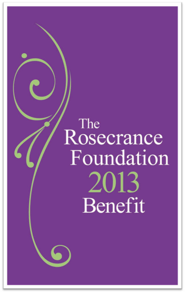
 2013 Foundation Benefit Program
Each year, Rosecrance holds a benefit event that helps provide much of the needed funding for addition and mental health treatment. Because the program isn’t an ad or promotion for the services Rosecrance offers, the designs could go in a different direction and use an alternative color palette — in this case, purple and green tones. Because the benefit is held in April, the design reflects a spring mood, which also ties into the Rosecrance message of recovery and renewal.

